
 Pantone has announced the colors of the year 2016: Rose Quartz and Serenity. CUPA STONE gives you a selection of natural stones with these tones to put your home on trend.
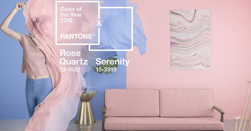
Pantone’s decision about the color of the year reflects the mood of what’s happening in our culture at the present time. The choice of Serenity (soft blue) and Rose Quartz (light pink) represents connection and wellness as well as a soothing sense of order and peace. Pantone’s news release describes the colors as “inducing feelings of stability, constancy, comfort and relaxation,” and argues that they “create balance in a chaotic world.” You can complete the trendy look of your house using natural stone.
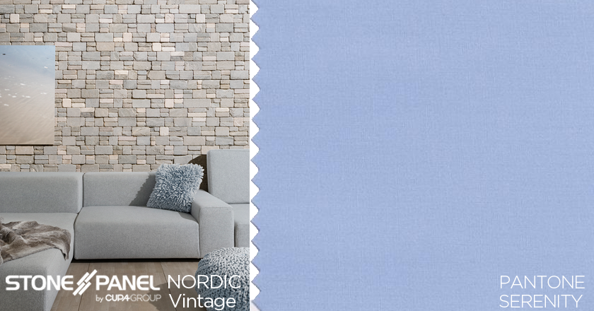
Serenity and Rose Quartz are reminiscent of nature. You can add this color using our natural stone in a wall, a countertop or a floor tile. You can find the blue of Serenity in our natural stone panel STONEPANEL™ NORDIC and STONEPANEL™ NORDIC Vintage. The grey quartzite with blue tones from STONEPANEL™ NORDIC gives a sense of freshness and brightness to simple and renovated spaces. The aged finish of STONEPANEL™ NORDIC Vintage softens the relief of the panel and makes it a suitable stone for interior cladding. This natural stone panel combines shades of blue with other depths of cream, offering hues of serenity.
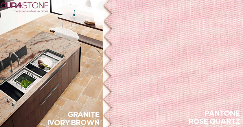
You will find the tones of Rose Quartz in our IVORY BROWN granite, with reddish background and black and grey speckles. Its richness in essential colors as well as its calm and array of tones provides this granite certain uniqueness among other similar granites. It is perfect for both interior and exterior appliances creating a stylish design.
Take a look at Pantone colors of the year 2016.
You can visit CUPA STONE website.
Share article


